Keep Your Composure
Where else but southwest Montana do you get jaw-dropping scenery just taking Sparky for a walk around the block? Capturing the magnificence on camera, however, can prove challenging. You might find that, all too often, your images are flat and fail to convey the true glory of Montana. But by implementing a few basic rules of design and composition, you can start getting images that match the grandeur of what you see.
One basic rule of composition is the “rule of thirds.” You see it in all forms of art and graphic design. The rule of thirds is rooted in the science of how our brains work. Imagine your frame is divided into three equally wide columns and three equally tall rows, so that it looks like a tic-tac-toe board. Putting your subject directly in the center box is not going to get you a striking image. Instead, look at the four corners of that center box and you’ll see that they are each 1/3 of the way into the frame. Put your subject on one of those corners and you will immediately have a more compelling image.
When viewing a picture, the tendency is for the eye to enter from the left and scan across to the right—the way we read a book. Therefore, putting your subject on one of the right-side tic-tac-toe intersections will also usually lead to stronger composition.
Nature is full of lines—large scale and small—from tree trunks to dirt trails to flower stems and petals. Look through your viewfinder for naturally occurring lines and use them to lead the viewer right to your subject. If the eye has something to follow from the left to the right through the image, it will be very pleased! But be careful not to lead your viewer right out of the frame. Make sure you have a subject with visual interest that will make the viewer pause to study it a while.
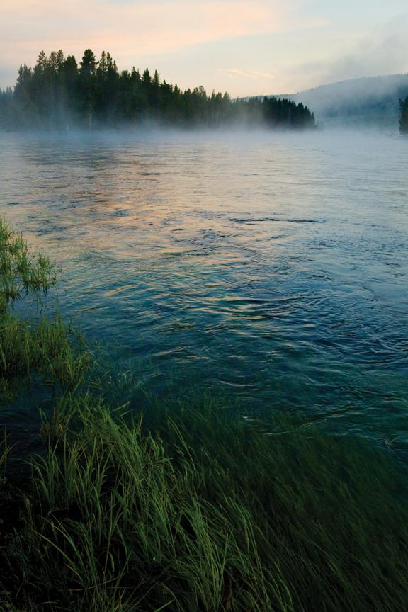
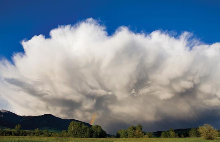
Speaking of lines in nature, let’s talk horizons. Just like your subject, you should avoid having the horizon in the center of your frame. Follow the rule of thirds and keep it at either the top third or bottom third of your frame. Put it at the bottom third of your frame to emphasize those big Montana skies. Or keep your horizon in the top third of your frame if you want to emphasize the river that runs through it.
Implementing the rule of thirds and using leading lines will do wonders for elevating your images from snapshots to greatness. To really create a work of art, you’ll need to get a little creative. Most adults view the world from a height of five to six feet. Simply taking your lens to a different plane will make an image just a little less ordinary. Find a rock or tree to climb, or kneel down to get lower. You will be amazed how different the view can be just a foot or two closer to the ground.
Another way to get creative is to shoot in a vertical orientation. Landscapes often lend themselves to wide horizontal and even panoramic frames, but mix it up by rotating your camera for an unexpected and compelling shot that can bring a dignity to your subject that is lost in a wide shot.
Spring is one of the best times in Montana to get spectacular images. Nature is full of the unexpected this time of year with mud, snow, new buds, and blooms all in the same scene. Daffodils seem to sprout out of a field of white when we get our typical late spring snow. Follow some simple rules of composition with these unique scenes and you’ll have so many frame-worthy images, you’ll be looking for a house with bigger walls!
Amy Shertzer is a professional photographer based in Bozeman and L.A. (amyshertzerphotography.com).
Photos by Amy Shertzer


